[vc_row up_bg_fix=”yes” css=”.vc_custom_1707591788340{padding-top: 25px !important;padding-bottom: 25px !important;background-color: #000a06 !important;background-position: center !important;background-repeat: no-repeat !important;background-size: cover !important;}”][vc_column][vc_custom_heading text=”Portable Ops” font_container=”tag:h2|text_align:left|color:%23ffffff” use_theme_fonts=”yes”][/vc_column][/vc_row][vc_row up_bg_fix=”yes” css=”.vc_custom_1707602130943{padding-top: 15px !important;padding-bottom: 50px !important;}”][vc_column][vc_row_inner css=”.vc_custom_1707602248693{margin-bottom: 50px !important;padding-top: 20px !important;padding-right: 20px !important;padding-bottom: 20px !important;padding-left: 20px !important;background-color: rgba(87,143,191,0.25) !important;*background-color: rgb(87,143,191) !important;}”][vc_column_inner width=”1/2″][vc_column_text]
Context
“Portable Ops” is an action-packed shooter game crafted and brought to life by my brother and me alone. Available for PC on Steam and soon to hit Xbox (release date to be determined), this adrenaline-fueled adventure puts you in the shoes of a mercenary soldier for hire, navigating the challenges of the modern era. With both single-player and multiplayer modes, you can experience intense combat from either a first-person or third-person perspective, offering endless possibilities for thrilling gameplay.
Role
UI designer
Map designer
Special feature programmer
Video creator
Duration
October 2022 – November 2023
Tools
 Unreal Engine 5
  Figma
Figma
 Adobe Illustrator
  Adobe Photoshop[/vc_column_text][/vc_column_inner][vc_column_inner width=”1/2″][vc_video link=”https://youtu.be/Mpe2EusEWEQ”][vc_column_text]

![]() [/vc_column_text][/vc_column_inner][/vc_row_inner][vc_row_inner][vc_column_inner][vc_column_text]
[/vc_column_text][/vc_column_inner][/vc_row_inner][vc_row_inner][vc_column_inner][vc_column_text]
Summary
Action shooters are known for their high-speed gameplay, where split-second decisions are crucial amidst constant gunfire and objectives. However, amidst the chaos, players still require essential information to understand the world’s situation. While some details need to be readily accessible, others may not be constantly needed but remain vital for informed gameplay.
How do we achieve the goal of giving enough UI but not so much it becomes clutter to the player?
To find the answer, we started by asking the question:
What UI is important to the player at a specific point in time?
The final solution is shown below – read on for more in depth look at the process.[/vc_column_text][/vc_column_inner][/vc_row_inner][/vc_column][/vc_row][vc_row][vc_column][vc_column_text css=”.vc_custom_1707602228012{padding-bottom: 25px !important;}”]
Final Design
[/vc_column_text][/vc_column][/vc_row][vc_row css=”.vc_custom_1707602113356{padding-bottom: 75px !important;}”][vc_column][vc_single_image image=”5324″ img_size=”full” alignment=”center” onclick=”link_image”][/vc_column][/vc_row][vc_row][vc_column][vc_column_text css=”.vc_custom_1708041300235{padding-bottom: 25px !important;}”]
Project Goals
- Design a spacious, open view for players while providing essential information.
- Enhance team interaction through on-screen notifications.
- Display the player’s progress clearly and succinctly to promote replayability.
[/vc_column_text][vc_column_text css=”.vc_custom_1708042507076{padding-bottom: 75px !important;}”]
Project Process
To accomlish our goals, we used an iterative design process.
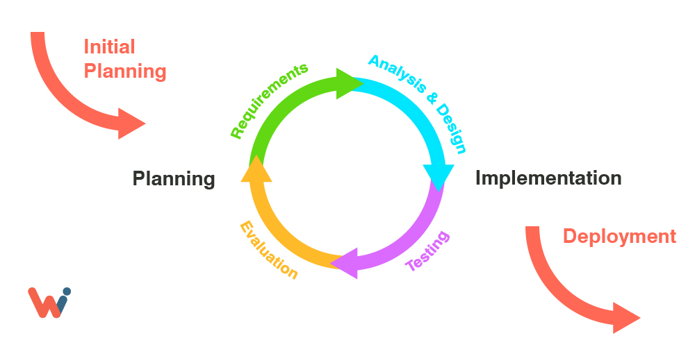
Planning and Requirements: Initially, the requirements lacked clarity, with certain information presumed necessary but ultimately overlooked by players during gameplay. Consequently, we conducted testing sessions to gauge actual usage during casual play.
Analysis and Design: We devised interfaces we deemed essential or aesthetically appealing, drawing inspiration from established conventions in classic and contemporary shooters.
Implementation: The new interfaces were integrated alongside major updates, allowing for ample feedback periods between iterations.
Testing: Through announced testing sessions on Discord, we assembled small groups comprising individuals who had provided valuable feedback previously, as well as new players for fresh insights. Session recordings facilitated subsequent evaluation and review.
Evaluation and Review: While many iterations yielded positive responses, some changes proved insufficient or went unnoticed, shedding light on players’ focal points during gameplay versus interface feedback. Adopting a strategy of incremental adjustments, we tested various interface setups over weeks, sometimes opting for removal to streamline the experience and prevent information overload—from excess to just the right amount.[/vc_column_text][vc_column_text]
User Play Testing the UI
[/vc_column_text][vc_column_text]We sought input from players early in the development process. However, since the game hadn’t been released yet, we needed to actively recruit testers. After analyzing Steam charts and conducting third-party genre research, we targeted PC gamers aged 30-50 who play shooter games at least twice a week, have a preference for realism and military themes, and are active in other gaming communities.
To find these players, we searched through existing Call of Duty, America’s Army, and SOCOM gaming groups. After obtaining permission from group leaders, we reached out to offer the opportunity to participate in the Portable Ops beta testing phase.
Recruits were invited to join the Portable Ops Discord Channel, where they received an introduction to the game, and individual and group testing sessions were scheduled. During these sessions, my brother and I observed as the players engaged in matches, providing vocal feedback via Discord. We also recorded numerous sessions for later evaluation, focusing on details and transitional actions.[/vc_column_text][vc_column_text css=”.vc_custom_1708043054635{padding-bottom: 50px !important;}”]
UI Research
We categorized elements based on two standards: “Immediately” and “Eventually.” This classification distinguishes between information crucial for the current moment or else the player risks losing out, versus information that the player may want to access but has the luxury of time to search for.[/vc_column_text][/vc_column][/vc_row][vc_row css=”.vc_custom_1707602000625{padding-bottom: 25px !important;}”][vc_column][vc_column_text]
Immediately Necessary
Damage Inflicted: Players requested instant feedback regarding the damage dealt to enemies.
Action Required: Players appeared to lose track of crucial issues like running out of ammo. Initially, we aimed for immersive gameplay by providing minimal information. However, this led to the opposite effect, as players struggled to keep track of their ammo and weapon status. To address this, we positioned the information off to the side but ensured it remained constantly visible.[/vc_column_text][/vc_column][/vc_row][vc_row css=”.vc_custom_1707602007547{padding-bottom: 50px !important;}”][vc_column width=”1/2″][vc_single_image image=”5305″ img_size=”full” onclick=”link_image”][/vc_column][vc_column width=”1/2″][vc_single_image image=”5300″ img_size=”full” onclick=”link_image”][/vc_column][/vc_row][vc_row css=”.vc_custom_1707602013194{padding-bottom: 25px !important;}”][vc_column][vc_column_text]
Eventually Necessary
Damage Taken: Players experiencing bleeding out struggled to understand why their health was depleting. Furthermore, once they realized the cause, they often found it challenging to recall how to heal themselves amidst the intensity of combat. Although bleeding wasn’t immediately fatal, its eventual lethality demanded prompt attention. To address this, reminders of bleeding status were displayed only when necessary to heal.
Search Bodies: Players have the option to scavenge bodies for ammo and supplies. Instead of persistently reminding players, the search option and corresponding key prompt are displayed only when directly facing a body. This approach maintains focus on combat during engagements and exposes players to potential attacks while replenishing supplies, adding a tactical dimension to survival.
Objectives: Players required reminders about current objective status, but constant updates were distracting. Displaying objective data only when necessary helped declutter the screen. Eventually, objective status was integrated with the compass, aiding players in orienting themselves and communicating objectives to teammates.[/vc_column_text][/vc_column][/vc_row][vc_row css=”.vc_custom_1707602018034{padding-bottom: 75px !important;}”][vc_column width=”1/3″][vc_single_image image=”5306″ img_size=”full” onclick=”link_image”][/vc_column][vc_column width=”1/3″][vc_single_image image=”5301″ img_size=”full” onclick=”link_image”][/vc_column][vc_column width=”1/3″][vc_single_image image=”5307″ img_size=”full” onclick=”link_image”][/vc_column][/vc_row][vc_row css=”.vc_custom_1707601944848{margin-bottom: 50px !important;}”][vc_column][vc_column_text]
Generative Brainstorm
We utilized online collaboration through Discord sessions to efficiently share our thoughts and suggestions regarding interface changes. Throughout numerous iterations, we primarily focused on implementing subtle adjustments in each version.[/vc_column_text][vc_column_text]
User Interface – Streamlining
In the end, we opted for an incredibly streamlined interface that facilitated smoother gameplay immersion for the players. They appreciated feeling a greater sense of purpose in their in-game roles. It was a win-win situation!
[/vc_column_text][/vc_column][/vc_row][vc_row css=”.vc_custom_1707601974103{padding-bottom: 50px !important;}”][vc_column width=”1/2″][vc_column_text]
Version 3
[/vc_column_text][vc_single_image image=”5316″ img_size=”full” onclick=”link_image”][/vc_column][vc_column width=”1/2″ css=”.vc_custom_1707602545843{background-color: rgba(129,215,66,0.24) !important;*background-color: rgb(129,215,66) !important;}”][vc_column_text]
Final Version
[/vc_column_text][vc_single_image image=”5317″ img_size=”full” onclick=”link_image”][/vc_column][/vc_row][vc_row][vc_column][vc_column_text]
UI / UX Aftermatch – What’s Next?
We observed that after matches, players were often uncertain about their next steps. Questions arose about whether they should search for a new match and what had happened to their unlocks. We aimed to showcase player progression while also emphasizing the significance of their unlocks in a straightforward manner.
To address this, we opted to provide clear explanations of their acquired items rather than leaving players to explore their characters for new additions.[/vc_column_text][/vc_column][/vc_row][vc_row css=”.vc_custom_1707601962911{margin-bottom: 50px !important;}”][vc_column width=”1/2″][vc_column_text]
Version 1
[/vc_column_text][vc_single_image image=”5313″ img_size=”full” onclick=”link_image”][/vc_column][vc_column width=”1/2″ css=”.vc_custom_1707602571591{background-color: rgba(129,215,66,0.24) !important;*background-color: rgb(129,215,66) !important;}”][vc_column_text]
Final Version
[/vc_column_text][vc_single_image image=”5304″ img_size=”full” onclick=”link_image”][/vc_column][/vc_row][vc_row css=”.vc_custom_1707601925487{padding-bottom: 100px !important;}”][vc_column][vc_column_text]
Impact
After countless iterations and revisions, I’m confident that our ultimate interface effectively communicates crucial information in a seamless and polished manner. The complaints and troubleshooting concerns raised by our playtesters vanished once they were able to easily access the information that had previously been unclear.
A surprising revelation for me was that the majority of players were not interested in intricate details. They simply wanted assurance of their progress and clear instructions on accessing their unlocks. The specifics of how or why seemed irrelevant to them. With this insight, our playtesters began spending the majority of their test game time actually playing![/vc_column_text][/vc_column][/vc_row][vc_row up_bg_fix=”yes” css=”.vc_custom_1707591697787{padding-top: 15px !important;padding-bottom: 100px !important;background-image: url(https://kevinsmith.art/wp-content/uploads/Kevin-Smith.jpg?id=4985) !important;background-position: center !important;background-repeat: no-repeat !important;background-size: cover !important;}”][vc_column][vc_row_inner css=”.vc_custom_1690685703829{margin-top: 0px !important;padding-top: 25px !important;padding-bottom: 10px !important;background-color: #ffffff !important;border-radius: 25px !important;}”][vc_column_inner width=”1/3″][vc_hoverbox image=”5275″ primary_title=”” hover_title=”Design elements in this FPS game” hover_background_color=”sky” el_width=”80″ hover_btn_title=”Check it out” hover_btn_color=”turquoise” hover_add_button=”true” css=”.vc_custom_1707591360696{margin-top: 25px !important;margin-bottom: 25px !important;}” el_class=”flipbox”]. . .[/vc_hoverbox][/vc_column_inner][vc_column_inner width=”1/3″][vc_hoverbox image=”5279″ primary_title=”” hover_title=”Mobile Casino style game in Mario Style” hover_background_color=”sky” el_width=”80″ hover_btn_title=”Check it out” hover_btn_color=”turquoise” hover_add_button=”true” css=”.vc_custom_1707591408505{margin-top: 25px !important;margin-bottom: 25px !important;}”]. . .[/vc_hoverbox][/vc_column_inner][vc_column_inner width=”1/3″][vc_hoverbox image=”5280″ primary_title=”” hover_title=”Classic UI for Card collection game” hover_background_color=”sky” el_width=”80″ hover_btn_title=”Check it out” hover_btn_color=”turquoise” hover_add_button=”true” css=”.vc_custom_1707591439035{margin-top: 25px !important;margin-bottom: 25px !important;}”]. . .[/vc_hoverbox][/vc_column_inner][/vc_row_inner][/vc_column][/vc_row]